Other
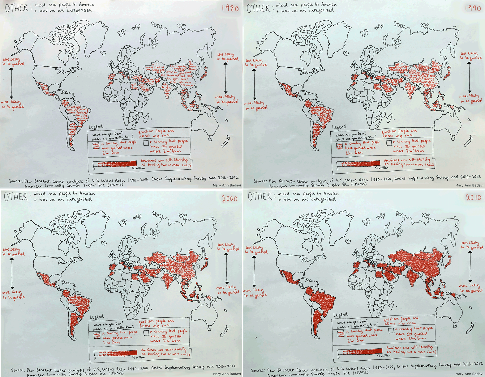
Many people have turned my racial ambiguity into a guessing game, and I wanted to codify this particular phenomenon into a map. At first, I just wanted to map the countries that people have guessed where I’m from. After all, the guesses span five continents. But I knew this data was rather personal, and not based on anything quantitative.
Inspired by personal visualization projects like Dear Data, I combined my personal data (where people have guessed I’m from) with population data on people who checked “two or more races” on the U.S. Census.
The Census introduced “Two or more races” as an option in 2000, when they introduced “race” as a category. (source) In previous years, the Census had asked for people’s “ancestry” or “ancestry or ethnic origin.” (source) In 2010, the only other Census year to compare with the original “race” question, people reporting “two or more races” grew from 6.8 million to 9.0 million people. (source) Pew Research Center suggests that even these numbers underreport the number of mixed race people in America. According to their research and projections, “U.S. population of two-race ancestry has more than doubled in size, from about 5.1 million in 1980 to 13.5 million in 2012.” (source)

Mapping
I wanted to show this rapid growth over time in relation to my own personal experience, so I chose to depict four layers on my map: first, the countries where people have guessed where I’m from. Second, the types of questions people ask me in order to make those guesses. These questions range from the classic “where are you from?” and “what are you?”, to “why do you act white?” and “what are you mixed with?” Third, the number of people in the United States who self-report as “two or more races” on the U.S. Census. Lastly, that number changing over time.
There are, of course, still problems with the data I have mapped. Concerns with Census Bureau data is well documented, and “two or more races” is a very general category. When choosing specific races within that set, “Caucasian/White” is a problematic substitute for “Middle Eastern.” Arab American advocacy groups are pushing for a new category called MENA, which stands for Middle Eastern and North African. There have been a number of projects attempting to more accurately collect data on mixed race people around the world, such as the Human Genome Diversity Project, which some accuse of scientific racism. There is a danger to putting people into neat boxes. Ultimately, that is what I hope to demonstrate with my map: that you can neither turn a human into a guessing game, nor simply shove them into the identity “Other.” After all, mixed race populations are growing around the world. And we deserve better.