Tech research and ethics, data visualization, UX/UI design, and writing professional.

MAB does DT

Posts tagged bootcamp 2019
When switching prototypes helps you with your own

Sharon and I switched projects today, with Sharon getting my audio-based project and me getting her color-based one. It was helpful to compare notes for two projects that both rely so heavily on one of the five senses, and in fact that commonality led us to develop prototypes for each other that helped solve for another one of the senses.

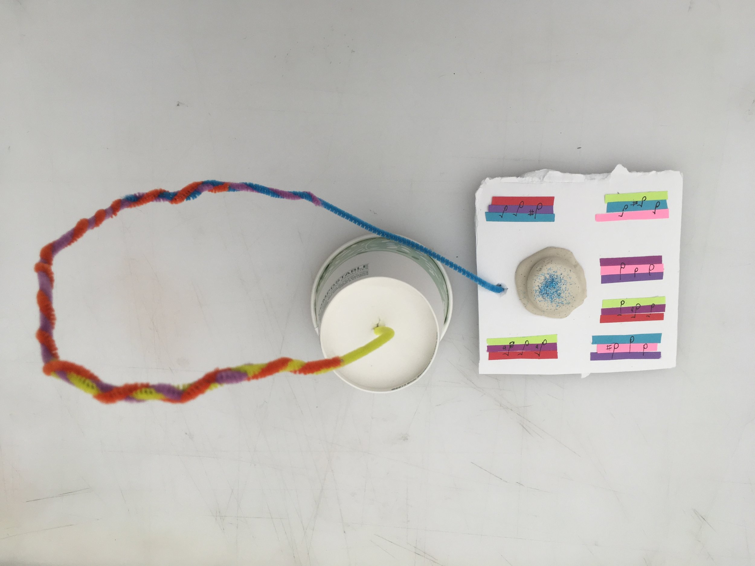
One of Sharon’s big questions that she had yet to answer was how visually-impaired people could interact with her project, which is entirely based on color and sight. To answer that question, I created a prototype that would also translate user’s moods into three sounds. Then, to simulate the feeling of seeing people’s different moods set up on trees, users could instead listen through a gallery of other audio moods.

It’s interesting that making a prototype for Sharon’s project had me create an audio experience like my own prototype, but I had to think about it in a different way using only the materials on hand. Though this prototype doesn’t actually produce audio, it gets the idea across—and creating the physical thing that users would interact with makes it seem more real.

Developing a prototype

It’s hard to come up with a prototype when your prototype is so dependent on sound—and you don’t have any instruments in your apartment!

prototype1.jpg

For my first lo-fi prototype, I simply sketched a 2D hallway of the Atlantic Avenue/Barclays Center station, with the appropriate lines. I assigned a musical note to each line: A for the 2 train, D for the 3 train, C for the B, E for the Q, G for the 4, and B for the 5. I purposely picked combinations that would create major chords, to avoid chord combinations that might cause sadness in moods. (Shoutout to the mapping episode of This American Life we listened to about everyday objects producing sad chords!)

Frustrated by my lack of keyboard (I used to have one in my old apartment), I used an online keyboard to recreate the note combinations I wanted. So for example, the 2/3 platform would sound like this:

As you go down the hallway from the main station, you would hear it as you approach the platform.

I also strung together all of the notes to form a “song” that would play at the Atlantic Ave stop (or if you were on a train approaching the stop). My thought is that these notes could be remixed by passengers in order to create new songs to play.

For my second prototype, I wanted something a little more interactive, where you would actually be able to hear the music while interacting with the prototype.

Using Adobe XD (for the first time!), I created different screens for each section of the station that would play different notes.

And now we wait for user testing!

Prototyping to fight surveillance birds

Joseph and I partnered for our in-class prototyping and immediately identified that we wanted to create a product that would address the concept of all birds becoming surveillance devices. Joseph has a background in apparel, so he came up with the idea of wearable cloaks that would have surveillance-blocking technology. Instead of just creating the actual product using fabric, we decided to create a diorama of a city street instead.

Using play-doh, we started to shape people wearing these cloaks. But because of the form of play-doh, the cloaks had more structure than regular fabric did. Because of this, we decided to make our wearable technology a little more structured. And thus, Pods were born.

IMG_7686.JPG

After we formed the Pods, we came up with the idea of accessorizing the Pods with various badges and belts, as well as different kinds of Pods—for kids, pets, couples, people in wheelchairs, etc. From there, we built the world around the Pods, creating the “surveillance birds” out of glue sticks and drawing the cityscape around the people.

Joseph created a detailed sketch of the Pods themselves, how they work, and their adaptations.

IMG_7688.JPG

Meanwhile, I created a narrative for the product, based on the prompt. My question about our technology was whether it would essentially “beat” the problem—that is, whether the surveillance pigeons would be ineffective due to our technology. Ultimately, we decided that they would, and our narrative reflects that.

Screen Shot 2019-08-07 at 10.45.54 PM.png

Creating this prototype was a great example of a team bringing each of their strengths to the table. Joseph supplied the knowledge and vision around the product itself, while I came up with some of the ideas on variation as well as the narrative context around the product.

Watching a design project take shape

Choosing three of the questions we brainstormed yesterday, we came up with some potential forms to answer them.

IMG_7674.JPG

I struggled with the first one, since I originally saw VR/AR as the form itself. However, to be more specific, I think this particular question could best be solved through an installation or experience.

Many people have tried to make public transportation easier to navigate. For form, I immediately thought of the most popular ways to do this: digitally, through websites or apps. However, I do think you could do something interesting with projection mapping in train stations to make navigation easier for passengers.

The last one was the least obvious to me. I was originally inspired to ask this question because of an article about the lack of accessibility in the DC restaurant scene (and I imagine New York has similar issues). Though traditional solutions would be through training workers and building in more accessibility ramps and tables, I think there is potential for experimental technology. There is already a whole world of wearable tech to make lives easier for those with disabilities: how can you apply that to the restaurant scene specifically? Similarly, how can you train algorithms to treat people with disabilities with more respect?

After switching forms with sectionmates, here is the question and form I ended up with:

IMG_7684.JPG

I didn't quite know what music deconstruction was, but decided to interpret it in my own way. Instead of explaining what I came up with, here’s the narrative for my project:

Jordan is a blind woman who takes the subway to work every day. She gets on the train at Franklin Ave, where there are several different lines. She hears the sound of a D major chord and follows it to her line, the 4 train. While she waits for the train to arrive, she moves to the center of the station, where there is a braille touchscreen she can use. She remixes the D major chord to form a song for the 4 train and submits it to the MTA, hoping maybe she’ll hear it on the train one day.

Once she gets on the train, she listens to the different chords that play at each stop. She knows the song that plays for Wall Street, which is her stop. As she disembarks and exits the station, she hears the other subway lines playing their own chords.

There are some potential sticking points with this project that I’ll have to think through. How do you make it so that people don’t get sick of hearing the same songs all the time? How do you account for sheer number of subway lines and stations in New York? How can you make it easier for people to remember which chords go with which stations?

These questions, though, made it easier for me to recognize the larger context of such a project, which you can see in my friction map.

IMG_7682.JPG

This project is exciting because it has the potential to help several different audiences. Blind people can use it, of course, but so can people who don’t speak English as their first language. Music is the universal language—well, that and math—so while it has its pitfalls to navigate, a project like this has the potential to be very useful.

Reflections on Kara Walker's "Event Horizon"
kara-walker-sketch.jpg

Above is my rough, two-minute sketch of Kara Walker’s “Event Horizon,” a mural on view at Arnhold Hall. I start by showing it not because it’s a good rendering of the piece—it’s very clearly not—but because it is a mural in two parts, and depending on which wall you look at first, you might come away with a distinct impression. I certainly did.

Located on the walls of a stairwell, the size and shape of the mural forces you to constantly look up or down: you can never really see the thing in full. And you can’t really tell which direction the mural is supposed to be viewed, either: on which wall does the story start?

My ten observations in the moment:

  1. The “tunnel” looks like the inside of a human intestine.

  2. Upon close examination, the mural is not paint as it appears; it’s actually stuck on like wallpaper.

  3. Although the entire mural is rather bleak, two of the children playing pattycake look to be less in despair. (Why?)

  4. While the figures are flat by nature, therefore seeming devoid of detail, there is very clear movement of each of them. Depending on which way you’re looking, you can almost tell which direction they are moving based on the wind blowing through their clothes or the way gravity makes them fall.

  5. There is a man with the hat close to the top of one of the walls, who appears to either be pushing down a woman with a child, or trying to catch them. Is he a slaveowner or a slave?

  6. Many of the women’s hair is very intricate with braids and bows.

  7. There are objects that upon first glance look like they may be rocks, but are actually dismembered hands and feet.

  8. There is only one woman with her hands bound: the one trying to catch the baby. The rest’s hands are free.

  9. The little girl at the top of the pit seems comfortable—she’s whistling and throwing something into the pit.

  10. Although at first I thought the direction was linear—that everyone was falling into the pit—it actually looks like some people are trying to crawl out, while others are falling.

Some observations from fellow classmates:

  1. The hair and features on some of the figures look stereotypically African.

  2. The figures’ hands are very expressive: you can tell which ones are pushing and which are pulling.

  3. The location of the mural is significant: with a staircase you can walk up or down, but the figures can only go down.

  4. There’s nowhere for a moment of respite. Even the two children playing have such a small space to sit, and it seems like they may not be able to get out.

  5. The figures are almost life-sized.

I left the mural with rather a bleak outlook. It seemed like these slaves had no opportunity for escape, like they were constantly in a state of free fall or entrapment. But upon research, I learned that the artist associated the passageway with the Underground Railroad, and that some of the figures could potentially reach opportunity.

When I looked at the piece in person, I was fixated on the little girl at the top. Why did she seem so peaceful? What was she throwing down into the pit? I even drew her side of the wall first, because I was so convinced she was somehow complicit in the horrible work of slavery. But with the knowledge that the work depicts the Underground Railroad, I’m able to view it with a little more optimism: maybe the little girl reached the other side, and is more at peace.

This would also explain the two children playing in the hole. Perhaps they are hiding, waiting out the horrors outside, and not actively falling or being pursued. This of course does not excuse the atrocities befalling the other figures: the woman losing her baby, the slave driver whipping someone into the hole, the screaming figures plummeting into the abyss.

I’m lucky to have seen some of Kara Walker’s other work at the National Portrait Gallery in Washington, D.C. That work was in the same style: silhouettes of primarily black people, sometimes fashioned stereotypically, facing horrible brutality through slavery. The style, which she developed in graduate school, allows the figures to appear cartoonish but also endless. There’s a wry bleakness to them that makes it hard to look away; it’s enthralling but also somewhat sickening. In short, it’s the perfect medium to depict the atrocities of human subjugation.