


1
2
3
October 2015
Web Production, Content Strategy
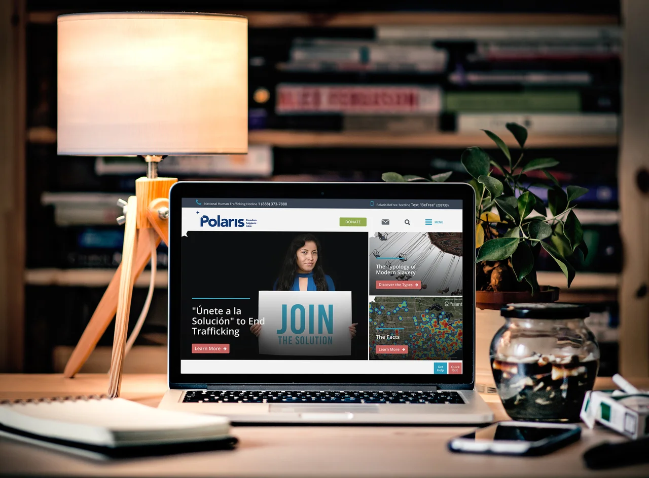
After 5+ years with the same website, the Polaris website needed a complete redesign. With a small budget, competing interests among programs, and an unclear organizational strategy, how could we best showcase what we do? The Communications team worked with Rad Campaign to redesign the site, and I served as the internal lead.
Content
We identified our main user goals: awareness and education, signing up for emails, and ultimately donating. One of our biggest problems is that we provide too much content, even getting down to the wonky details that often go over people’s heads. The user goals were able to help us steer programs into streamlining their content for the website. From there, I did a full content audit and created a new sitemap. I also wrote 50% of the new website’s content.
Design
A huge problem the anti-human trafficking field struggles with is how to depict the fight against modern slavery in a way that is empowering and positive, rather than hopeless and traumatic. For the redesign, I did extensive photo research on Getty Images to refresh our website’s look, opting to show stock photo models who would be survivors (posed in non-exploitative ways) or the industry in which trafficking happens rather than trafficking itself (e.g. a sign for a massage business, instead of a victim being forced to give massages).
Results
In the first month of the site’s launch, we saw lower bounce rates, more views on our basic human trafficking pages, and 50% more engagement with our reports and resources. The daily average of people joining our email list more than double, and the month after launch was our highest online revenue of 2015.